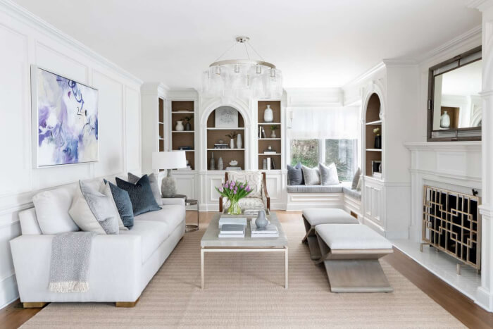
One of the first things you need to establish when designing a living room is a pleasing color scheme. Mostly it will serve as the primary inspiration for the entire design concept and create the atmosphere for many years to come. Additionally, since your living room is often the room that gets the most use in the house, it’s important to pick colors that will make you want to spend time there.
Changing the tone palette is one of the most straightforward living room ideas to entirely transform the area, whether you want to add color to the walls for a dramatic style makeover or add accent colors through accessories.
Consider changing your color scheme after being inspired by our living room color recommendations. We have a ton of living room paint color options approved by designers, whether you want something bold and vibrant, neutral, or dark and melancholy.
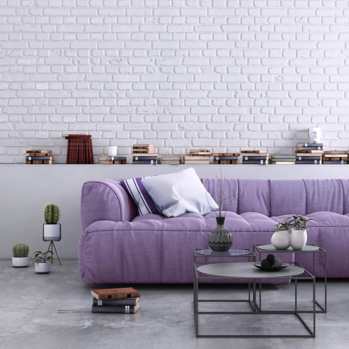
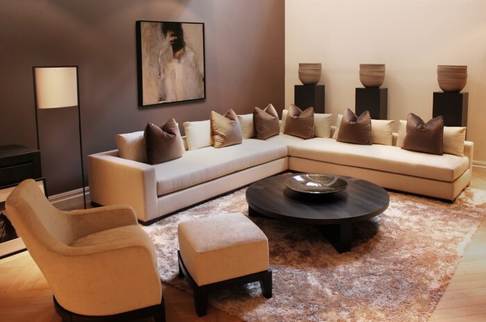
#1. Gray- Purple
 Source: Better Homes & Gardens
Do grey and purple go together? Briefly, the answer is yes. In fact, experts claim that a selected gray tint may complement a purple hue very effectively, allowing for the effective employment of a two-tone color scheme. The furniture in this living room brings the space to life. The gray walls look fantastic too, especially when they’re adorned with purple accents.
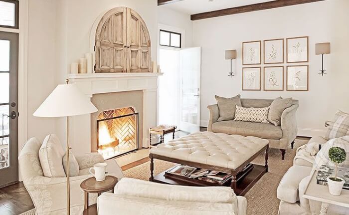
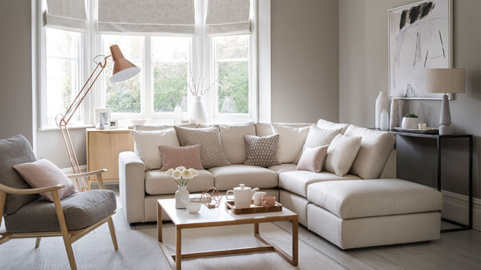
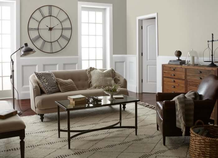
#2. Cream- Beige
 Source: Pinterest
Beige combined with Cream creates charming living rooms, adding to inspiring and harmonious space arrangements. Although these 2 colors are quite similar, they own their unique features that embellish the texture and patterns of your living room.
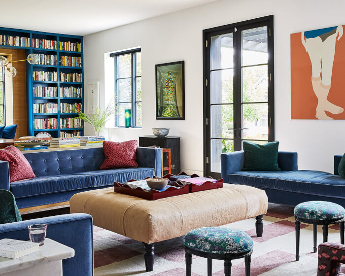
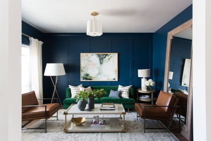
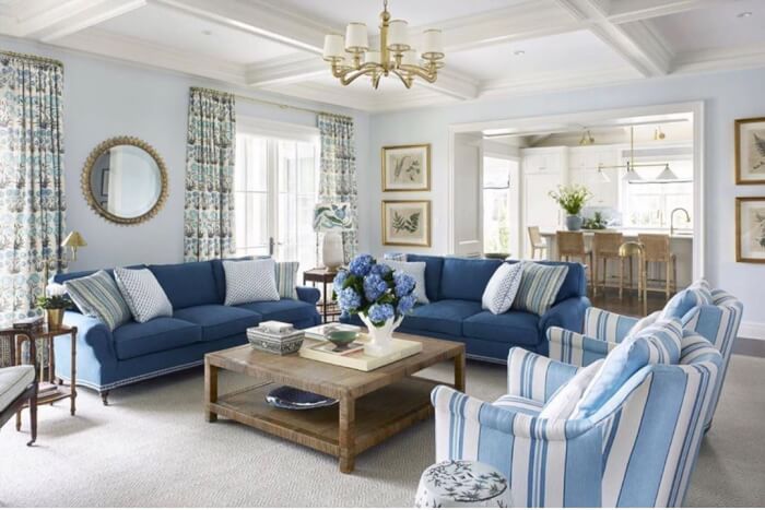
#3. Cerulean Blue
 Source: Martha Stewart
Blue shades covering the room exemplify how powerfully Cerulean Blue this color affects your living area. A pair of sofas with blue shades, adorned with window framed bookshelves would be a wish of anyone who wants to do a makeover for their living room.
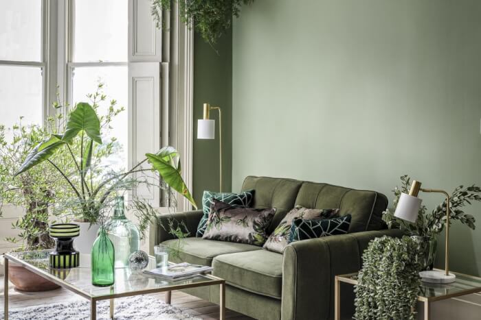
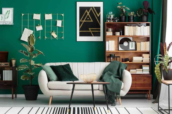
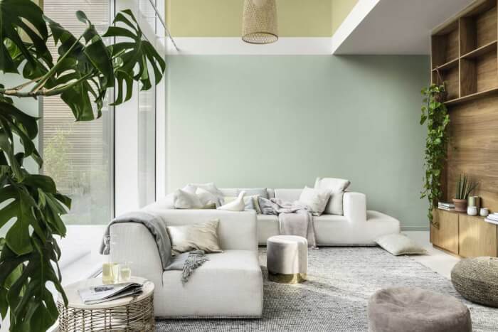
#4. Cloudy Green
 Source: YourHomeStyle
This hue is definitely strange to ones who like being simple. However, this is a splash of green to any living room. You will be convinced that this dramatic look will blow fresh air into your house, as this green scheme reminds you of a forest full of trees, plants, and birds singing along.
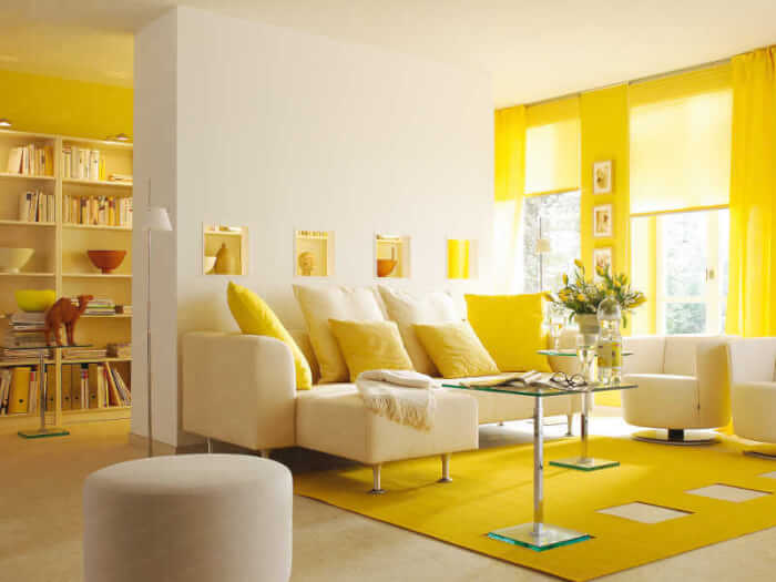
#5. Sunny Yellow
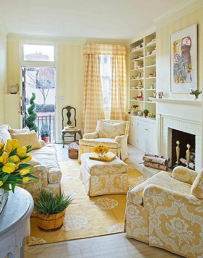 Source: Decoist
Yellow is a fascinating and energizing color. It provides lovely, cozy, and fashionable colors for the holiday table and room décor. Striped curtains are also an attractive point of this view, plus, cushions and a unique pattern sofa with a touch of sunny yellow color turn your room into a bright and positive space where you can enjoy your best living moments.
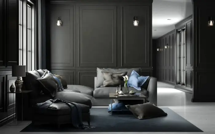
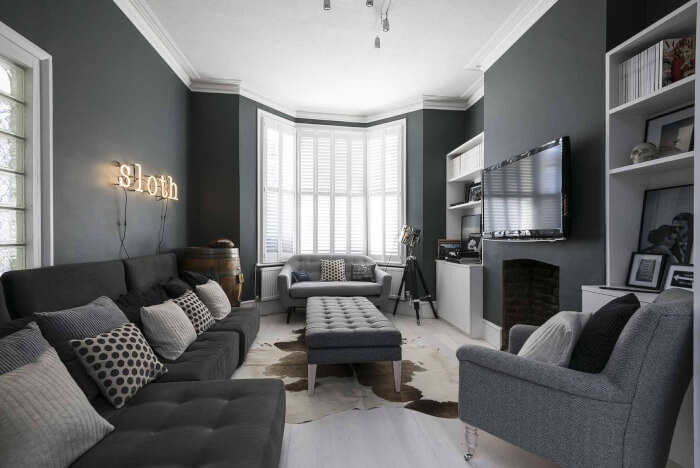
#6. Ebony
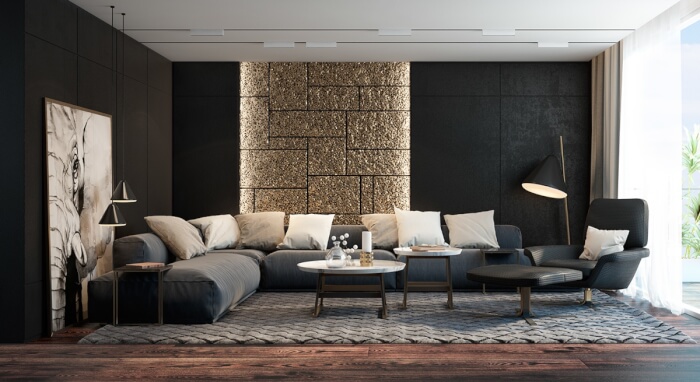 Source: Interior Design Ideas
We have good news if you adore the aesthetic of a black living room but are concerned that the color would overpower your area and make it impossible for your furniture and accessories to stand out. It is quite feasible to use black paint in your room without it taking over the entire room. You can still have a lot of fun with the color black if you don’t want to commit to covering all your walls with black. Your living area will benefit from the moodiness that black wallpaper or striking black furnishings bring.
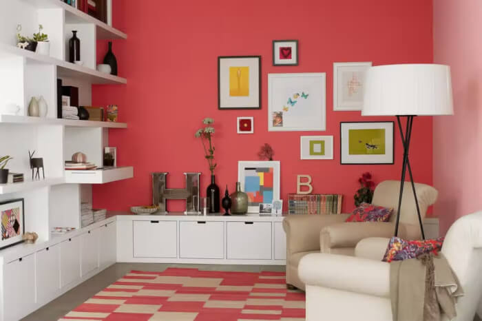
#7. Red Clay
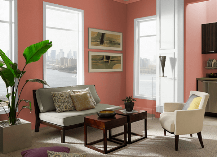 Source: Behr
Red Clay is a deep, muted orange with an earthy undertone and a dusty pink undertone. Any living or kitchen room would look beautiful painted in this hue. Combining it with warm copper and gold would be perfect. You can furnish this room with beige sofas and plant pots.
#8. Frost Blue
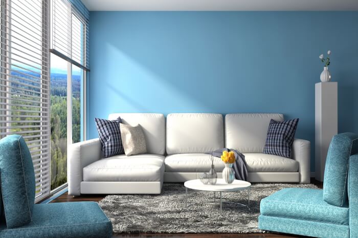 Source: Indigo Paints
Light, neutral baby blue with an undertone of indigo is called Blue Frost. It is the ideal shade of paint for a living room that brightens the room. Sand-colored hues and white accents go well with it.
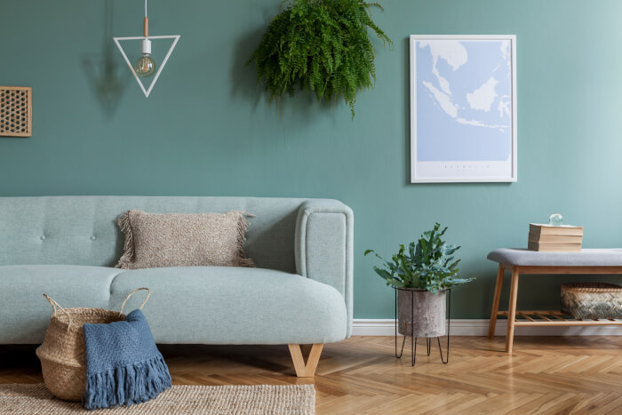
#9. Teal
 Source: – Home Decor Bliss
Building a mermaid living room calls for the use of teal paint colors, a stunning blue and green combination that spruce the room up with the sea atmosphere. Beautiful teal paint colors complement every property, regardless of its style or construction.
#10. Brilliant Blue
 Source: The Spruce
Brilliant Blue has an undertone of the night sky and is a deep, subdued, crystal lake blue. For a front entrance or accent wall, it is the ideal paint hue. Combine it with a paler version of this hue and sand-colored hues. Choose different color hues like white, green, and brown for your furniture.
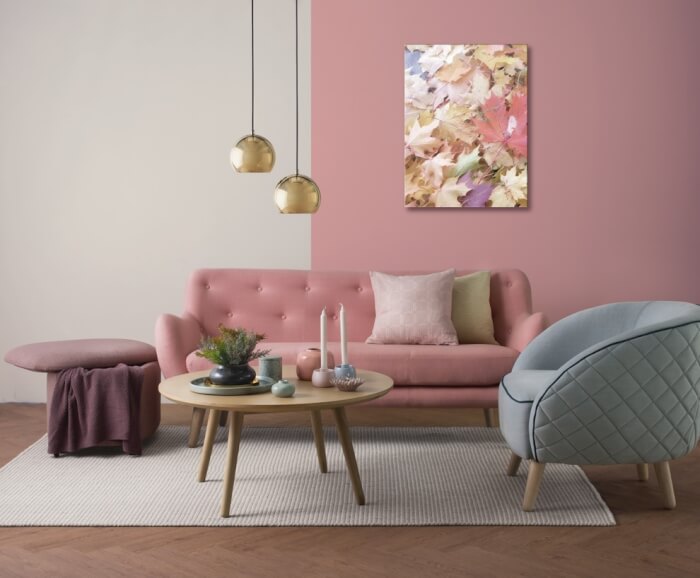
#11. Dusty Rose
 Source: Ian’s Close Up Magic
It is a muted but elegant tint. On the color wheel, dusty rose is a pale grayish-red shade that combines the hues of pink and violet. Dusty rose is a very well-liked hue for individuals who enjoy pleasant and charming décor.
#12. Pitch Black
 Source: Home Stratosphere
In every light, it is as bold and pure as black can be. This color is fantastic for modern and luxurious designs including walls, wood, and metal.
#13. Clay Bisque
 Source: Ideal Home
A pink undertone may be seen in Clay Bisque with a light gray, dusty greige color. It is the ideal shade of paint for a calming main wall in any room. For a modern, fresh effect, pair it with white or dark gray trim.
#14. White- Grey
 Source: Homes & Gardens
It has an ashen undertone and is a soft, warm seashell white. It is the ideal hue to paint any interior walls. Add white trim to it.
#15. Steel Gray
 Source: Pinterest
Steel gray is a metal-inspired tint that is somewhat bluer than gunmetal gray and quite similar in hue to silver. Many customers and artists alike favor this stunning hue.
#16. Light Lime Green
 Source: Better Homes & Gardens
High brightness and modest saturation characterize it. Lime green is energizing and fun. A few color psychology websites claim that lime green boosts motivation and clears the mind of negative ideas.
#17. Lemon Yellow
 Source: Interior Design Ideas
Lemon yellow isn’t what you’d call a subtle hue. It works well in spaces where you want to infuse vigor and vitality. It’s a good idea to use it in public areas that promote intimacy and conversations, like the gathering areas in your house.
#18. Crisp White
 Source: MyDomaine
White, the supreme neutral, lends every area an air of pristine tranquility. Whites are the most adaptable family of colors, bringing light into spaces and having a variety of undertones that can be either chilly or warm, allowing the proper white to perfectly match any accent color.
#19. Mint Green
 Source: Decor Aid
Every year, more and more hues that stand out are witnessed. One such color is mint green. It typically shows up in palettes of vibrant pastel colors. Over the last season, this variety has dominated interior design.
#20. Khaki
 Source: Home Design Lover
Khaki is regarded as a classy neutral hue that works well as a background and gives a place a natural aspect that can be maintained for many years without affecting the appearance of your living area.
#21. Coral
 Source: Evening Standard
One of those lovely colors that unexpectedly complements a variety of décor styles is definitely coral. The orange-undertoned color ranges in intensity from delicate pink to vivid red. It is the best option if you want to provide warmth and comfort to any area, whether it is classic or modern.
#22. Ever-Changing Neutral
 Source: Better Homes & Gardens
A fashionable living room may be built on a foundation of neutral colors. Paint, furnishings, and décor in tones of white, cream, gray, brown, and black provide a relaxed, pleasant ambiance.
#23. White and Marine Blue
 Source: Pinterest
Marine blue is a key component of the traditional coastal palette and, as its name suggests, is inspired by naval uniforms and the depths of the ocean. But away from the shore, this warm color with a faint undercurrent of green is even more emotional and pleasant.
#24. Pistachio
 Source: Decoist
The appealing light green hue of the pistachio nut has become a huge trend in the world of home design. This stunning hue is a favorite among designers since it is a modern and functional choice that goes well with a variety of styles.
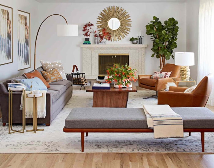
#25. Mocha
 Source: The Sofa & Chair Company
Mocha is a timeless neutral hue that works well in any setting. A space seems warm and inviting without being overly weighty thanks to the lighter tone of brown. Mocha is a light to medium brown tint that goes nicely with a variety of hues. It is a strikingly adaptable hue that looks well in almost every space of your house.
#26. Greige
 Source: Bob Vila
While grey is perhaps the most popular neutral in interior design today, ‘greige,’ a blend of grey and beige, is gaining popularity because of its ability to provide warmth to a design scheme that is predominantly grey. Greige combines the warming qualities of beige with the calmer, colder appearance of genuine grey to get the best of both worlds.
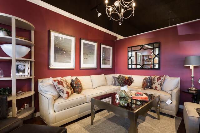
#27. Raspberry
 Source: Houzz
Raspberry is a grown-up hue of pink that leans more toward the red side. It is a stunning and fashionable color that is somewhat more stylish and sophisticated than other pink hues, making it a popular option for modernizing interiors in both classic and contemporary homes. Decorating with raspberry will give your interiors vitality and fun without making them either ultrafeminine or sickeningly sweet.
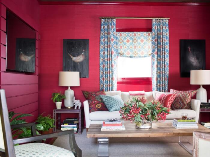
#28. Crimson
 Source: HGTV
Crimson red is a surprisingly adaptable shade for a color that seizes attention and adores the spotlight. Any environment may benefit from a good dose of vitality from vibrant crimson. This vivid shade of red can’t help but shine when combined with other intense hues like burgundy, royal blue, and olive.